From a process in your head to a number that survives the steering committee
One pass from start to finish: capture the workflow, estimate five figures, read the stress test, prove the intervention in money. No BPMN, no statistics, no measurement series — honest ranges are enough.
The process already exists
You know how the workflow runs and want to know where it jams and what fixing it would be worth. Seven steps, 45 minutes.
Go to the seven stepsPath BThere is no process yet
Five people, five habits, nothing written down. Then you start one level earlier: capture first, compute after.
Go to captureFirst run: 45 minutes. Every one after that: 15.
What FlowVisual is built for and what it isn't
FlowVisual is a decision instrument, not a documentation tool. It answers exactly one question: where does the process actually jam, and what would it be worth to intervene right there? Anything that doesn't answer that question is missing on purpose.
Use it for
- Checking, before you invest, whether software, a new hire or automation pays off at that particular point.
- Quantifying the bottleneck instead of guessing it, including whether a person or a system sets the limit.
- Building a business case that survives a review by finance: ranges, assumptions, before-and-after.
- Test the workflow on a strong day rather than on the average — and see where the constraint moves once the first one is fixed.
Don't use it for
- Process maps for an audit or a quality manual. For that, take BPMN and a suite that manages versions.
- Running the process. FlowVisual calculates; it starts no workflows and writes to no system.
- Process mining. It reads no log files from your ERP. You enter volumes and times yourself.
- False precision. If you expect a single number with a decimal place, you'll get a range and a probability instead.
- Owners and division heads in mid-sized companies facing an investment decision.
- Process owners who have a suspicion and need evidence.
- Consultants and internal project leads who have to present a before-and-after.
This page walks the FLOWREFY method through one process: which numbers it needs, how to read the result and where it falls apart. Operating the program itself, the click paths, the system requirements and the release notes, live on the product site: Hands-on guide on flowvisual.app.
When there is no process yet
The normal case in a mid-sized company is not the bad process but the unwritten one: five people do the same thing in five ways, and none of them is written down anywhere. Before anything can be computed, the workflow has to exist on paper at all. That is what capture is for.
Nobody drags boxes in a workshop. You type while somebody talks — one line per step, Enter for the next. The chain wires itself:
- 01
Request arrives - 02
Price the quote @sales 20-40min - 03
Approval @boss 5min ?above 10k - 04
Rework @sales !missing details
- Request arrivesnot stated
- Price the quote20–40 min@sales
- ◇ Approval5 min@boss?above 10k
- Rework@sales!missing details
- @
- who does it
- 20-40min
- duration, as a range
- ?
- the condition
- !
- what hurts here
Role, duration, condition and pain point are optional. A bare line is a valid line. What nobody said stays open — and the app says so, instead of inventing a zero.
This too remains an estimate, and that is the point: capture is not process mining and reads no log files. It makes sure that a workflow you can actually compute exists by the end of a meeting — instead of a photo of a brown-paper wall.
From a template
Six ready-made example processes, each one of our sample analyses: quotation, invoice approval, complaint, onboarding, service desk, order handling. Open it, rename it, bend it to your own reality.
On a blank canvas
Open capture and type while someone talks. By the end, steps, roles and duration ranges are already in the model — not in a notebook nobody ever transcribes.
From your own documents
Work instructions, handover memos, manuals: FlowVisual reads them through your own AI endpoint and proposes steps and figures. Every proposal carries a verbatim quote and the file it came from, and nothing enters the model before you accept that line.
What you need before you start
Five figures, no more. Estimates are fine. FlowVisual works in ranges, not point values. Waiting for a clean measurement campaign means never starting.
| Figure | Example | Where from |
|---|---|---|
| Volume per day and its variation | 10 enquiries/day, ±35 % | CRM, invoicing system, or the person who does it daily. The variation matters more than it looks: it is what creates the peak day on which the process breaks. |
| Handling time per step | 10 to 40 minutes | Ask for the fastest and the worst case, not for the average. |
| Waiting time between steps | 0.5 to 3 days | Timestamps in the inbox or ticket system. Usually the larger half of cycle time. |
| Capacity per role | 1.5 people, 6 hrs/day on the process | Count net: subtract holidays, meetings and interruptions. |
| Cost rate per role | 55 euros per hour, fully loaded | Payroll including overheads divided by productive hours. |
Don't have all five? Start anyway. A range of 10 to 60 minutes is an honest input and produces a usable result. An invented 7.5 does not.
Seven steps to a result
The order is not arbitrary. The bottleneck appears in step 6, in the stress test. Fix it beforehand and shape the model around it, and you get your own assumption handed back, neatly formatted and worthless.
- 01Step 1 · Find
Create the area and the process
In the sidebar, create the area (sales, order handling, service) and inside it the one process that costs you the most money. Not three. One.
What you do- 01Create the area, name the process, the way it is actually called internally.
- 02Set start and end: where does a case begin, when is it done?
- 03Enter daily volume and variation — the average day and the peak day are derived from them.
- What you see
- An empty canvas with start and end nodes, and the process name in the sidebar.
- Common mistake
- Drawing the boundaries too wide. “From first contact to payment received” is four processes. Model the one you have a suspicion about.
Stage 1 — only trigger and result are fixed - 02Step 2 · Lay bare
Click the flow, don't describe it
Place the steps in the order a case actually runs, not the order it is supposed to run in. Decisions, rework loops and drop-offs are building blocks of their own.
What you do- 01Place steps, decisions, sub-processes and drop-offs with a click.
- 02Draw the rework loops: every correction is a path, not a footnote.
- 03Consolidate beyond 15 steps. Granularity is not a quality mark.
- What you see
- The flow as a chain of building blocks, with the live preview beside it.
- Common mistake
- Modelling the target process. If every third order really comes back, that path belongs in the model. Otherwise you're simulating a company that doesn't exist.
Stage 2 — the workflow, rework path included 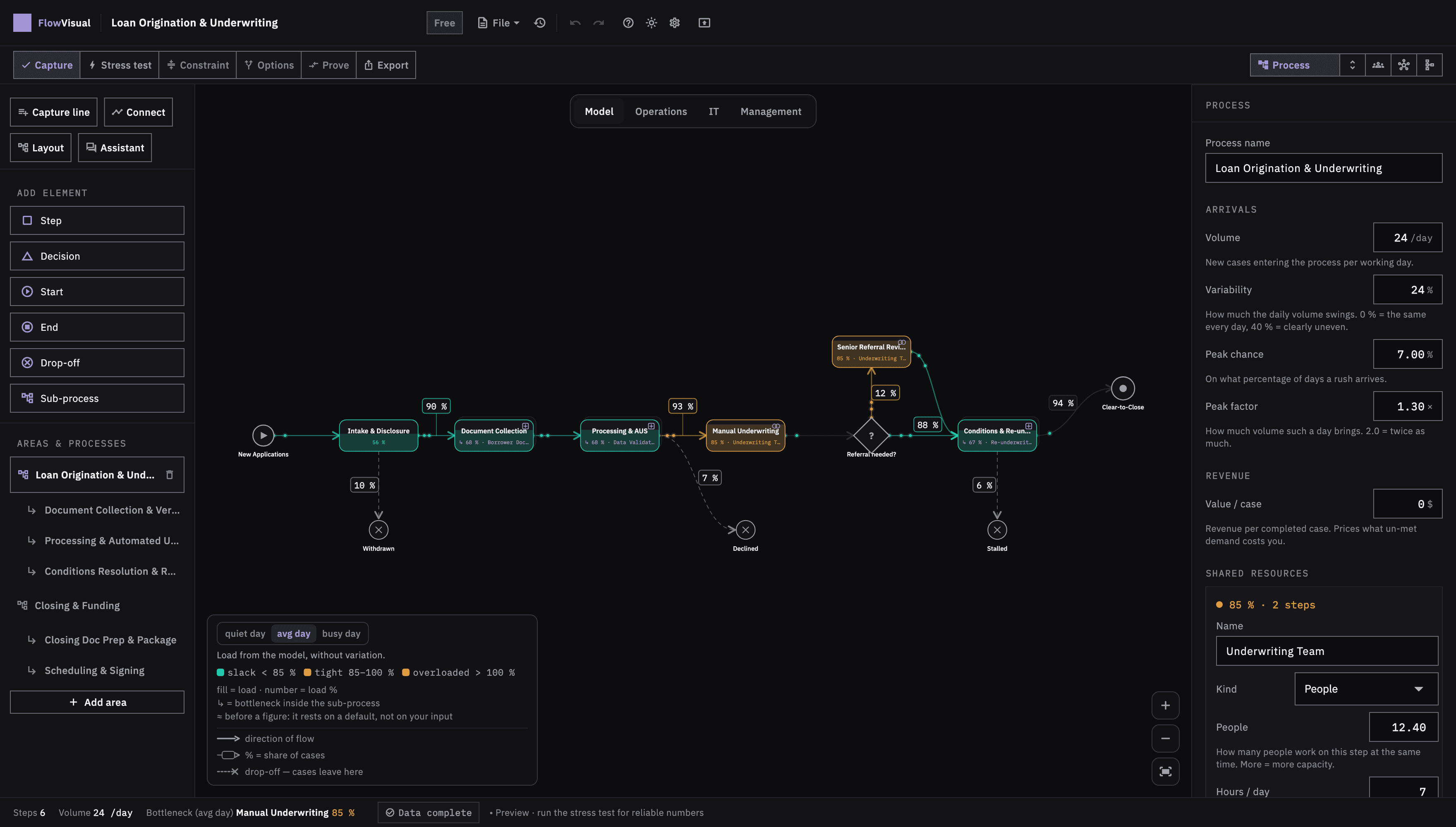
Fig. 2Click the flow, don't describe it - 03Step 3 · Lay bare
Enter times as ranges
Every step gets a handling time as a range and, where there is one, a waiting time in front of it. Two numbers instead of one: fastest case, worst case.
What you do- 01Enter handling time from–to, not the average.
- 02Capture waiting time separately: the time nobody is working.
- 03Attach error and rework rates to the decisions.
- What you see
- Building blocks carrying time ranges; the preview shows a first cycle time.
- Common mistake
- Forgetting waiting time. In most office processes a case sits idle longer than anyone works on it. Enter handling time only and you optimise the wrong half.
Stage 3 — a range per step instead of a value - 04Step 4 · Lay bare
Assign roles and capacities
Every step needs a role, every role a real capacity. Not headcount, but hours that genuinely land in this process.
What you do- 01Assign a role per step. Name individuals only where a single person is the bottleneck.
- 02Enter net capacity per role: hours per day on this process.
- 03Store the cost rate per role so euros come out at the end.
- What you see
- The domain lens colours utilisation per role: below 85 % is comfortable, up to 100 % is tight, above that is overloaded. Red means exactly that and nothing else.
- Common mistake
- Counting 8 hours a day. Four to six is realistic. Overstated capacity makes every bottleneck disappear, and the simulation sounds the all-clear where there is none.
Stage 4 — roles and their utilisation 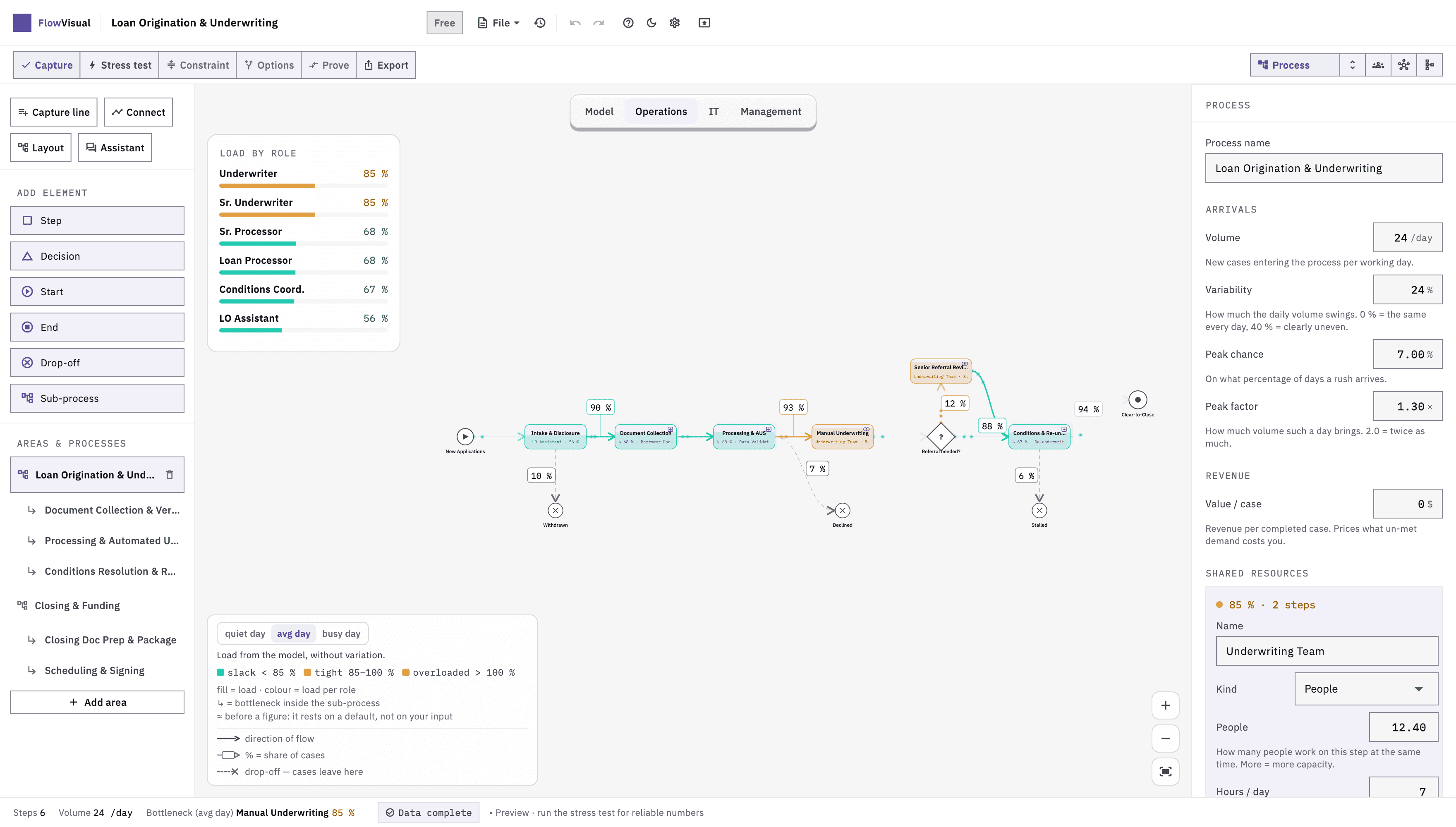
Fig. 4Assign roles and capacities - 05Step 5 · Fit
Mark systems and media breaks
Record the system each step runs in. Wherever data is re-typed from one system into the next, you have a media break, and with it time, errors and rework.
What you do- 01Enter the system per step: ERP, CRM, Excel, inbox, paper.
- 02Check the transitions: where does the system change? That's the media break.
- 03Estimate the rework rate at those break points realistically.
- What you see
- The IT lens shows load per system and the points where data is retyped by hand. What closing a break would be worth is computed later, in the options list, in euros per year.
- Common mistake
- Not counting Excel and the inbox as systems. That's exactly where the most expensive break points sit, not in the ERP.
Stage 5 — systems, and where data is retyped 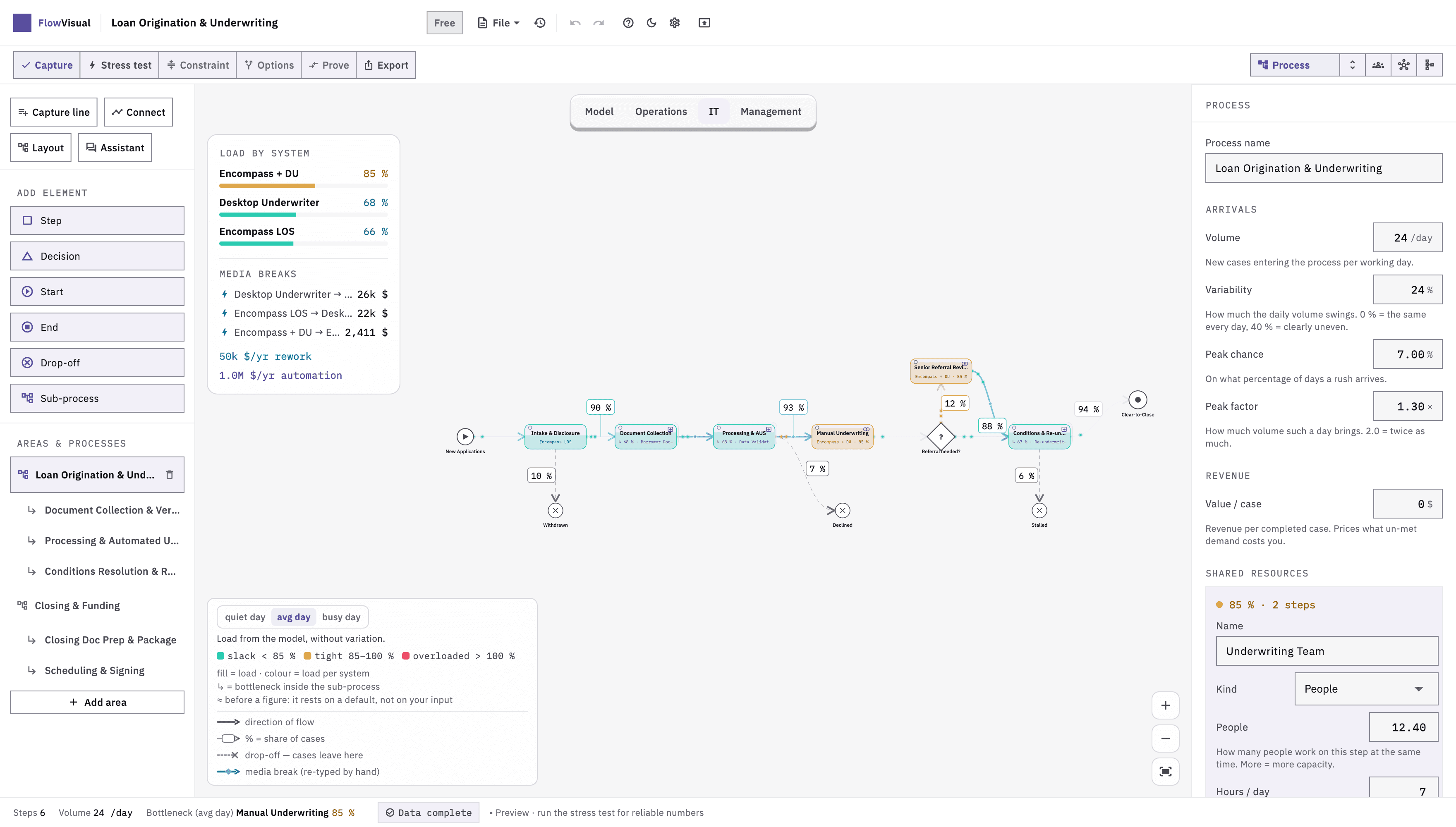
Fig. 5Mark systems and media breaks - 06Step 6 · Observe
Run the stress test and read the bottleneck
Now FlowVisual runs a few hundred random working days, each drawing different values from your ranges. Only here does the constraint appear — out of load, not out of opinion.
What you do- 01Start the stress test and pick the load basis: quiet day (P10), average day, or peak day (P90).
- 02Open the tightest step: load on the peak day, share of days over capacity, remaining headroom („carries +20 % volume“).
- 03Note the cycle time: typical day (P50), bad day (P90), and the extreme day behind it (mean of the worst 5 %).
- What you see
- Where it jams right now, the distribution of cycle time, and throughput — separate figures per load basis.
- Common mistake
- Reading the average day only. Processes do not break at the mean, they break on the peak day. The headroom figure tells you how far away that is.
Stage 6 — the constraint and the distribution 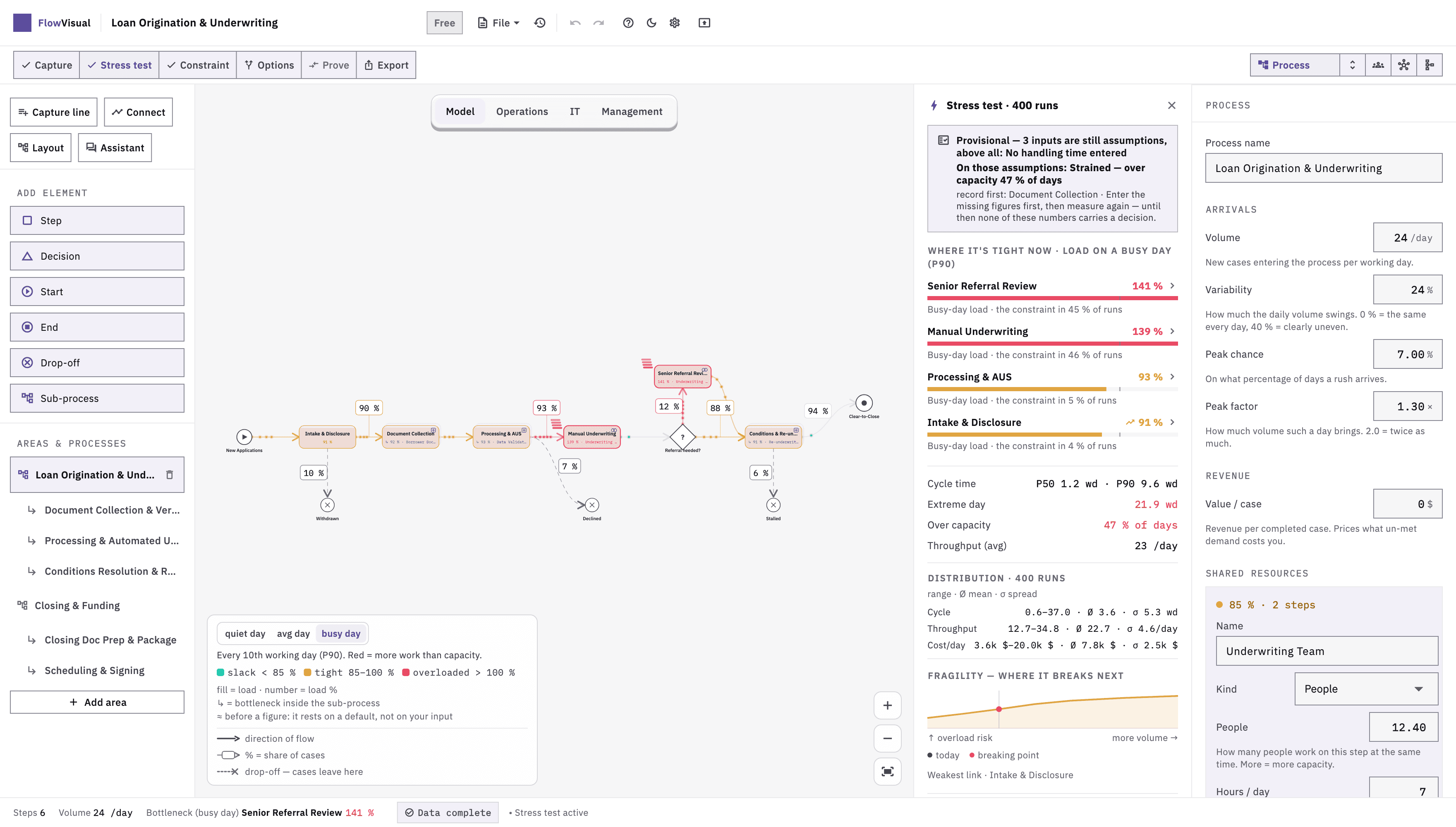
Fig. 6Run the stress test and read the bottleneck - 07Step 7 · Weigh & Yield
Simulate the intervention, export before-and-after
FlowVisual derives options from the stress test itself and ranks them. You review them, add your own variant where needed — and every one is fully re-simulated, not extrapolated.
What you do- 01Read the proposed options (close a media break, automate, change staffing) or create your own variant.
- 02Read the difference per variant: cycle time, throughput, euros per year — with a P10–P90 range from the same runs.
- 03Export the proposal as PDF; documentation as PDF or Word, and the data as JSON.
- What you see
- Two runs side by side and a ranked recommendation — including the honest line about which option is not worth it.
- Common mistake
- Changing three things at once. You end up knowing it got better, but not from what. One change, one run.
Stage 7 — before, after, difference
Reading the results
Four numbers decide. Each answers a different question, and each has a threshold at which it triggers an action.
Before you read the four metrics, a demonstration of what the stress test actually does: the same process, hundreds of times, each run drawing different values from your ranges. The distribution on the right is where P50 and P90 come from.
Your bottleneck is not a property of the process. It is a property of the situation.
The same five steps, four situations. One run draws one duration per step — one possible day. Five hundred runs make a distribution. Switch the situation and watch the bottleneck move.
An ordinary month. Nothing unusual happens — which is exactly what every process is designed for.
- Capture the order—
- Technical review—
- Material / supplier—
- Approval—
- Dispatch—
3 h 03 min
The figure everyone calculates.
—
—
This gap is where deadlines break.
- Capture the order0 %
- Technical review0 %
- Material / supplier0 %
- Approval0 %
- Dispatch0 %
| Metric | What it says | What you do with it |
|---|---|---|
| Load on the peak day (P90) | How full a step runs on a strong day — the one that occurs every tenth working day. | The top step is the only one where an intervention pays. Everything below it improves something that is waiting anyway. |
| Cycle time P50 · P90 · extreme day | P50 is the typical day, P90 the bad one, the extreme day the mean of the worst five percent. The distance between them measures unpredictability. | A wide range is a problem in itself: you cannot commit to anything. Narrowing the range is often worth more than lowering the average. |
| Utilisation per role | What share of available time a role is tied up in the process. | Beyond roughly 85 percent, waiting time rises disproportionately. Roles above it are candidates for redistribution, not automatically for a new hire. |
| Value per option, in euros per year | What a single measure saves per year, computed from the same runs — on the basis of either work performed or seats actually filled. | Hold it against the cost of the fix. If it comes out lower, doing nothing is the right result. That is a result too. |
A number without a range is a guess. When a result arrives as a single point value, the information about how certain it is went missing. That is exactly what decides whether you can put a budget behind it.
Why not Excel, Visio or a BPM suite
The four common categories are not worse. They answer a different question. Pick the wrong category and you get a clean answer to the question you didn't ask.
| Category | Answers | Effort | Limit |
|---|---|---|---|
| Drawing tool | What does the flow look like? | Hours | The picture doesn't calculate. A diagram shows sequence, never load. |
| Spreadsheet | What does the process cost on average? | Hours to days | Adds up averages. But queues come from variability, and the spreadsheet systematically cancels it out. |
| BPM suite | How is the process documented and approved? | Weeks, plus notation | Built for governance and execution. The investment question isn't what it centres on. |
| Simulation lab | How does a complex system behave in detail? | Weeks, plus expertise | Powerful and expensive. Oversized for a single mid-market investment decision. |
| FlowVisual | Where is the bottleneck, and what would an intervention there be worth? | 45 minutes | Deliberately narrow: no notation, no execution, no governance. |
The difference isn't feature count, it's the question. A diagram documents, a spreadsheet adds up, a suite administers. FlowVisual calculates variability, and variability is why processes jam.
What FlowVisual cannot do
Four limits worth knowing before the first run. A tool that hides its limits produces numbers that fall apart in the first critical conversation.
It doesn't measure for you
FlowVisual reads no data from your systems. The inputs come from you. The result is only as good as the ranges you enter, which is why honest ranges beat precise wishful numbers.
It executes nothing
No workflow start, no interface, no writing into ERP or CRM. FlowVisual ends at the decision; implementation happens elsewhere.
It doesn't replace the conversation
The rework loops that make a process genuinely expensive are known by the people who run it daily. Model with them, not over their heads.
It gives no certainty
A simulation yields probabilities, not promises. P90 means nine out of ten cases below it, not all of them.
The five most common mistakes
None of these makes the result merely less precise. Each makes it wrong, and in a predictable direction.
- 01
Deciding the bottleneck up front
ProblemIf you already know where it jams, you model towards it without noticing. The run then confirms the assumption. A circular argument.
BetterWrite the suspicion down, turn it face down, model with an open mind. Compare afterwards. Where the two differ is exactly where the insight is.
- 02
Entering averages instead of ranges
ProblemAverages produce a process without queues. The very variability that causes the jam is cancelled out.
BetterAlways from–to. If you only know one value: minus 40 percent, plus 80 percent. Closer to reality than the point value.
- 03
Modelling too finely
ProblemForty steps cost two hours of modelling and don't improve the result. The bottleneck rarely sits in the fine print.
BetterTen to fifteen steps. Consolidate first, refine later, and only where the stress test points.
- 04
Ignoring waiting time
ProblemCapturing handling time only halves cycle time on paper and moves the bottleneck to the wrong place.
BetterCapture the waits between steps too, even roughly. One day of waiting outweighs ten minutes of handling.
- 05
Converting savings into full-time posts
ProblemFour hours saved per week is not half a post. It is four hours spent differently. The cost stays.
BetterReport savings in time and throughput, and decide separately whether they ever turn into a cost reduction.
Work through the guide on your own process
Version 1.2. Modelling, saving and PDF export are free — everything on this page works without a licence. Pro removes the watermark and adds your own letterhead.
After the guide
The guide ends with a result. These three pages show what becomes of it.
- 01
Read the sample analyses
Every analysis in the archive was produced with this instrument: model, measurement, finding, and the limits of the analysis.
Open - 02
The method behind it
Eight steps, two halves: FLOW measures, REFY refines. This guide is the part the software takes over.
Open - 03
Free calculators
Process costs, bottleneck, maturity and automation. For a first approximation in the browser, no install.
Open
Frequently asked questions about using it
Budget 45 minutes for the first process: roughly 30 minutes modelling, the rest stress test and evaluation. Every process after that takes about 15 minutes, because roles, cost rates and systems are already stored.
No. FlowVisual works in ranges. An honest estimate of 10 to 40 minutes gives a more defensible result than a precise-looking average of 22.5 minutes, because the range carries the variability that causes the jam.
The process is calculated hundreds of times, and on each pass a random time is drawn from your range for every step, so at the end you see not one result but the distribution of all plausible results.
Because processes don't fail on average, they fail at the peak. P10 is the good day, P90 the bad one. The distance between them tells you whether you can promise a customer a date. The average never does.
No, deliberately not. You click steps, decisions, drop-offs and sub-processes together. FlowVisual serves measurement, not standards-compliant documentation. There are BPMN tools for that.
Yes. The app runs locally on macOS and Windows, with no account and no cloud. Your process files stay on your own drive, which matters once volumes, cost rates and staffing sit in the model.
Modelling, saving and the PDFs are free; the PDF then carries a watermark and the standard header. Pro removes both and adds your own letterhead, Word export and team seats — from 199 € per year for one seat, 399 € for three (gross prices, the trial starts at checkout). Through the App Store it runs as an annual subscription with one free week.
Yes. The PDF export contains the model, the assumptions, before-and-after, and the ranges. One thing matters for the paper: keep the assumptions visible. A number without its assumption falls apart at the first critical question.
Yes — start at section 02. Capture in FlowVisual is built for exactly this case: you type one line per step during the meeting, role and duration as markers in the same line, and the chain wires itself. Alternatively you start from one of the six templates, or have existing work instructions read in — every proposal from that carries a verbatim quote and is accepted one line at a time. What you end up with is a workflow that can be computed. What follows is the seven steps of this guide.
Rather walk through it together?
In 20 minutes we'll capture your most expensive process and run the stress test with you, live, on your numbers.
No sales pitch. No slides. Just straight talk.